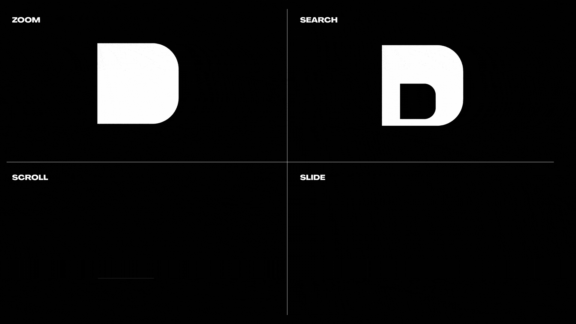
DTV Project type
Superform Project type
Moo Project type
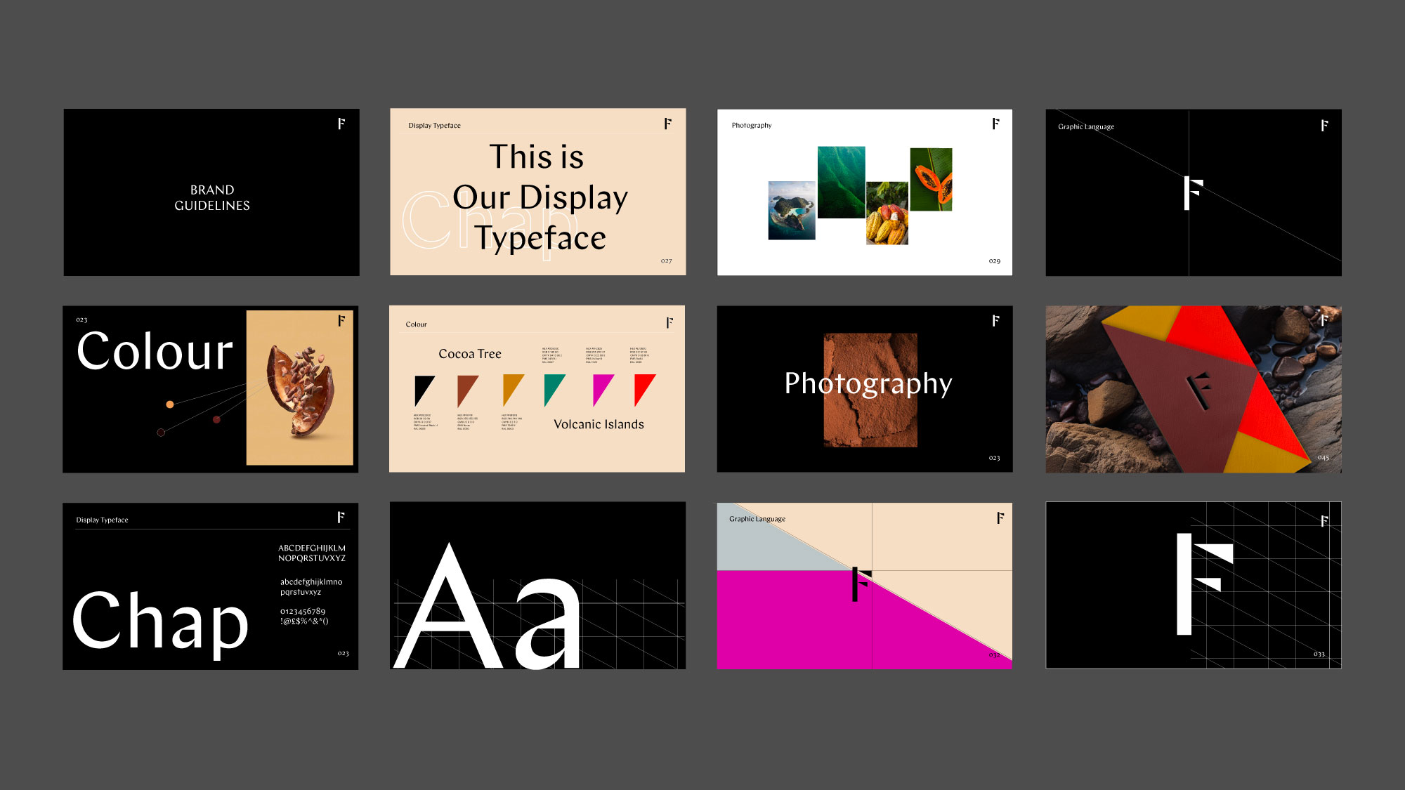
Firetree Branding
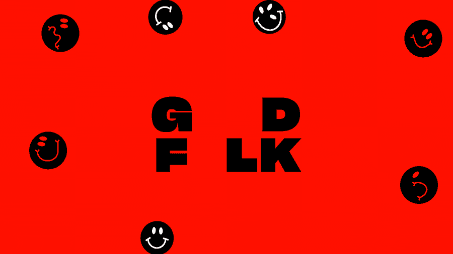
Good Folk Project type
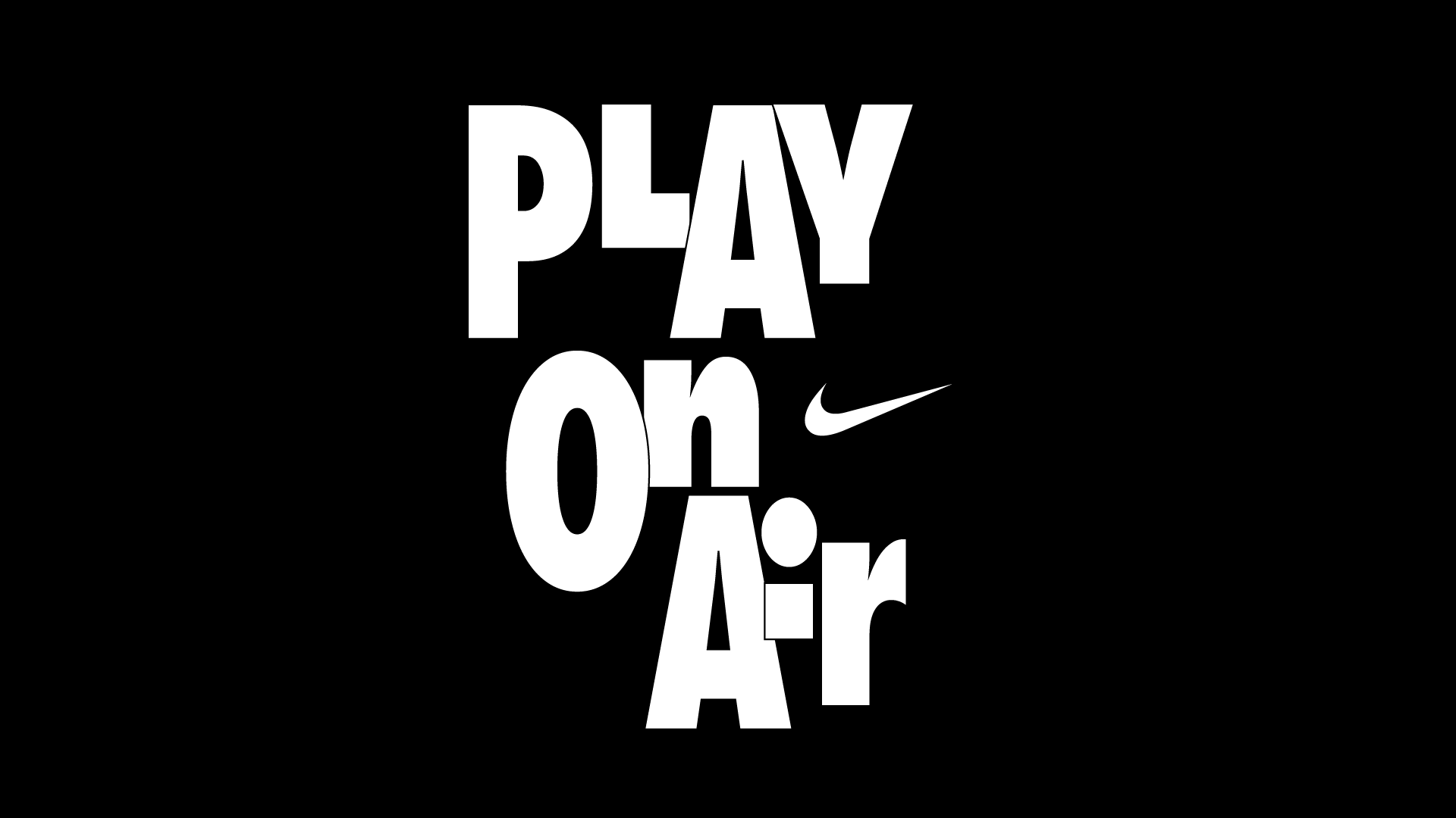
Nike Project type
Jenny Sweetnam Project type
Youtube Project type
ed@edessex.com