ED ESSEX
DESIGN
MOTION
ABOUT
ED ESSEX
DESIGN
MOTION
ABOUT
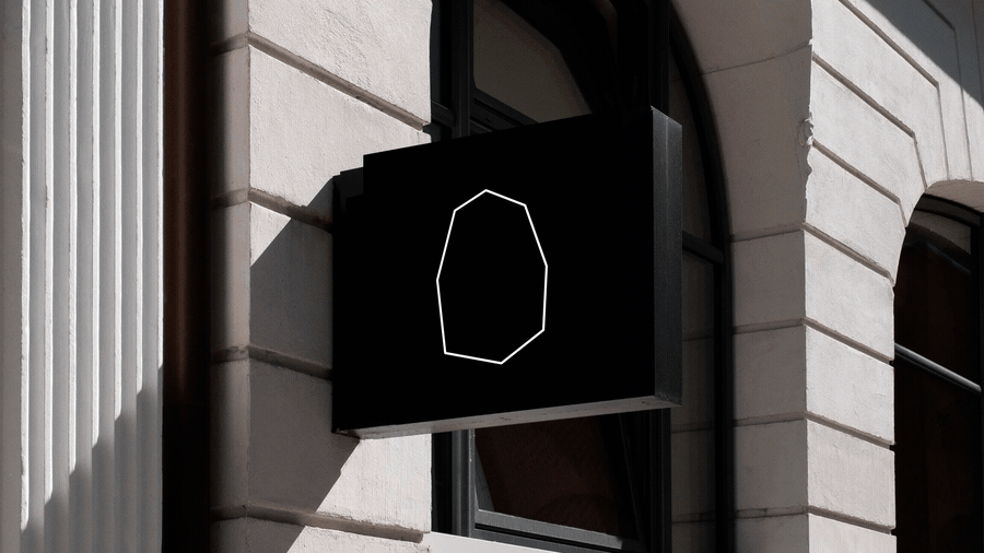
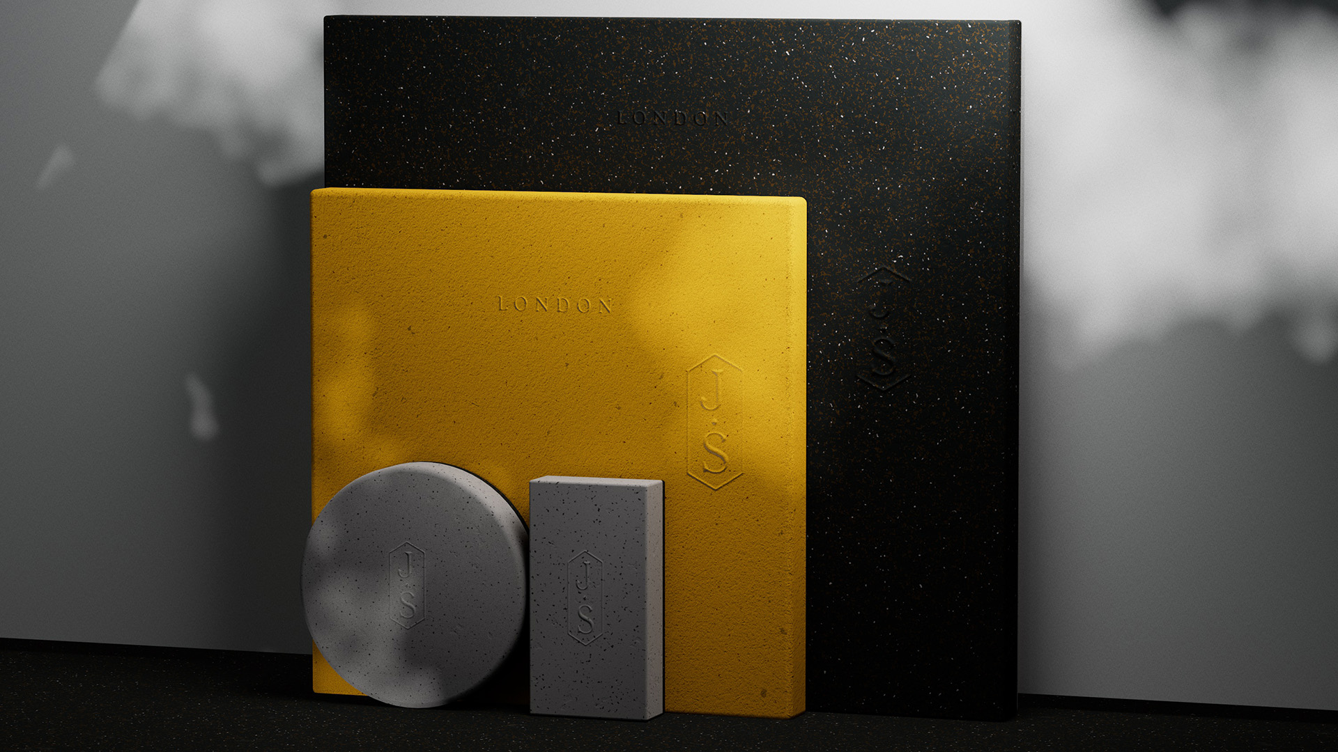
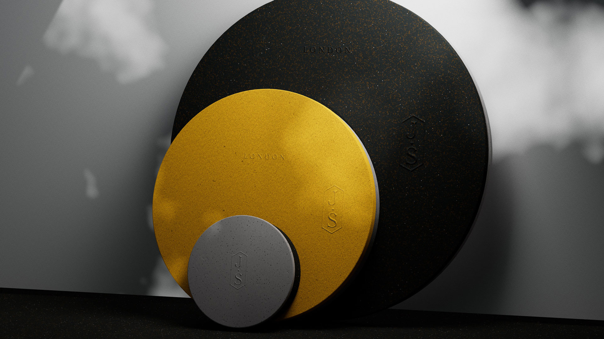
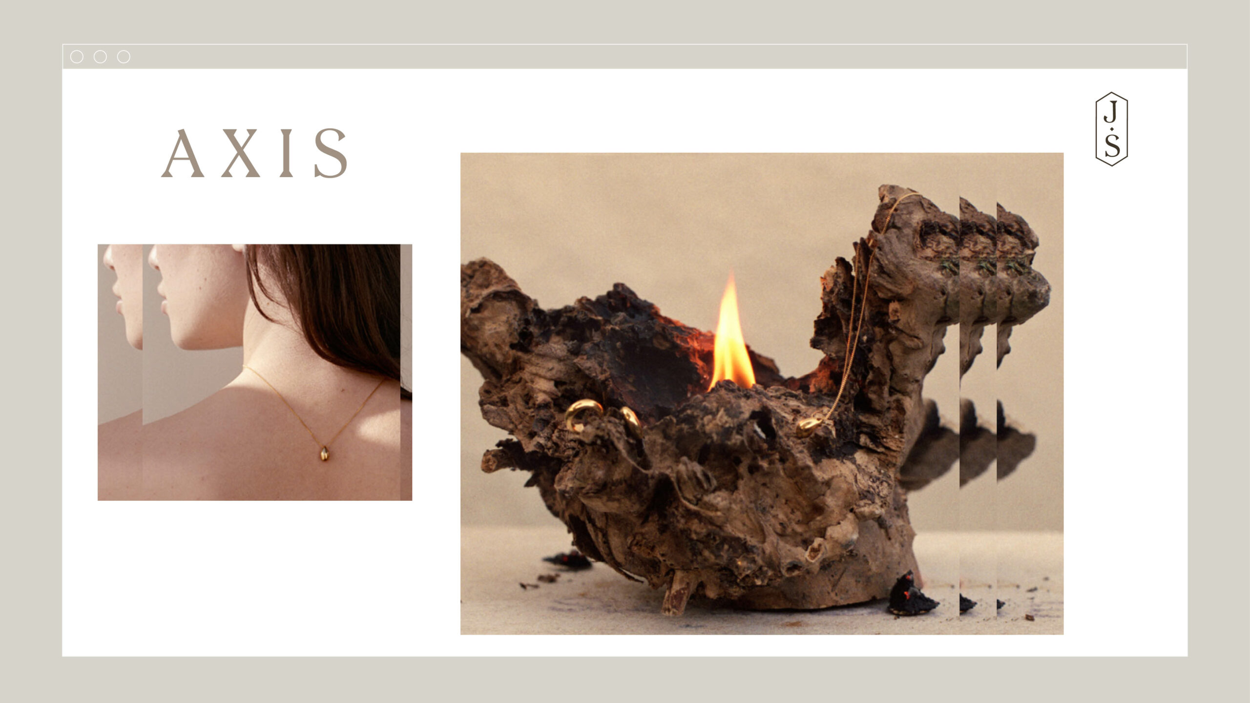
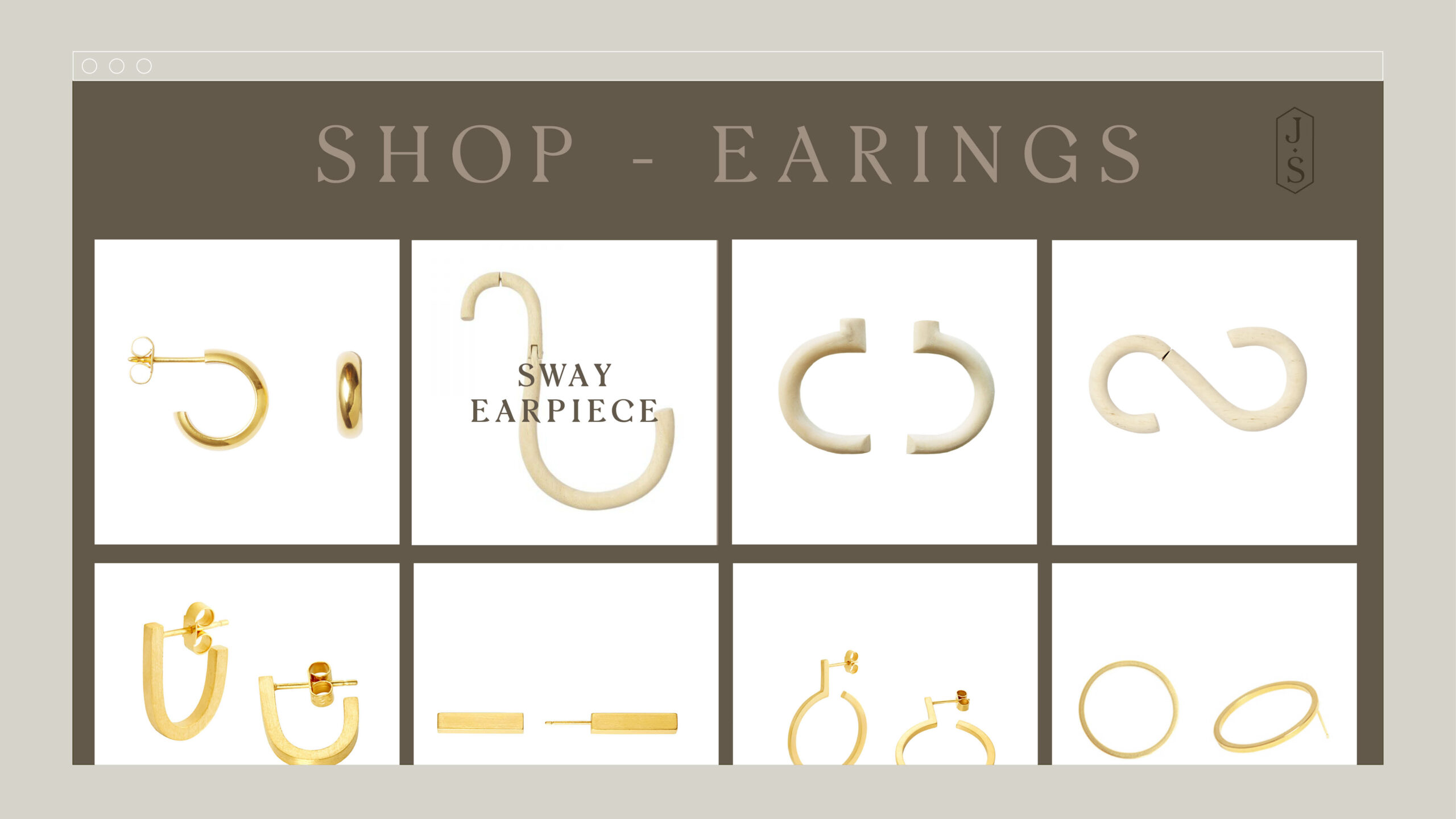
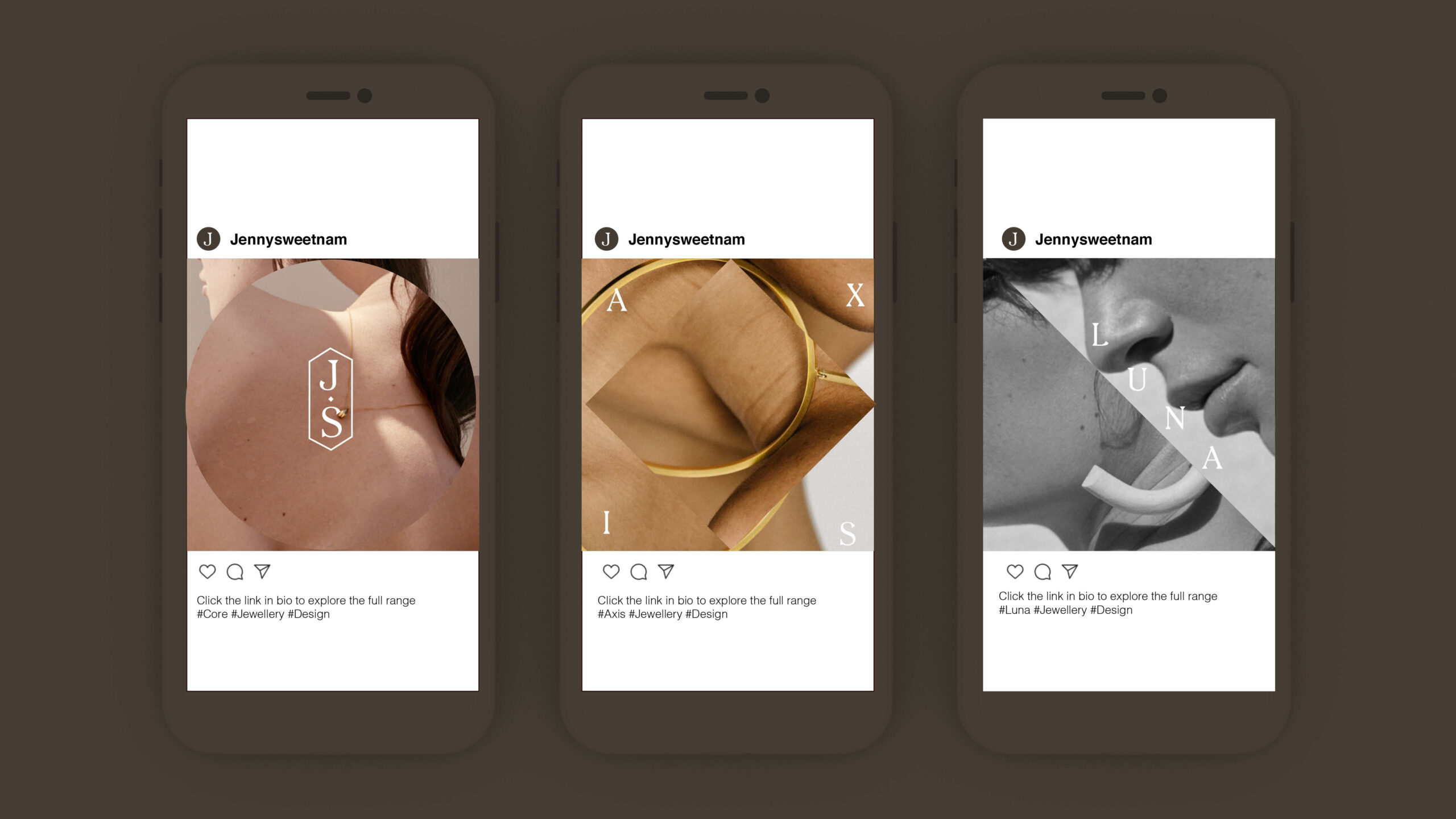
Jenny Sweetnam
Prev
DTV
Next
Ineos
ed@edessex.com